The Freemium Experience
Lead Product Designer
Dedicated pod including the product lead, product manager & 5 developers
Context
Tailor Brands started as an AI logo maker, but over time evolved into a full branding platform. Despite offering a growing suite of tools and assets, most users still perceived it as "just a logo generator" and left before discovering the subscription's real value.
I was a part of a cross-functional team responsible for validating a new freemium experience through rapid experimentation and A/B testing. I partnered closely with the Product Manager throughout the project; brainstorming experiments, running user research, conducting interviews, and shaping the product direction. Beyond UX design, I contributed to product decisions, hypothesis validation, and experiment planning.
Goal
Increase subscription conversion by exposing users to Tailor's broader branding experience before the paywall.
Outcome
- ✓Validated Freemium strategy
- ✓Improved subscription conversion
- ✓Higher revenue potential
- ✓Increased engagement with premium features
Previous flow
Users completed the entire logo creation process believing they were purchasing a single logo. Only at the end of the journey were they introduced to a subscription plan, before they had experienced the value of the broader platform. This resulted in substantial drop-offs at the plans page and again before checkout.
home page
Brief + Industry
Choose logo type
Choose style:
New flow
Two core changes drove the new flow:
1. Skipping the plans and cart page entirely
2. Replacing the post-purchase payment confirmation with a modal that reassured users they'd finished part one (the logo) and were moving into part two, the branding platform.
home page
Brief + Industry
Choose logo type
Choose style:
Research & Validation
To reduce uncertainty and validate our assumptions, we combined qualitative and quantitative research throughout the project. Rather than relying on a single research phase, we continuously tested ideas to better understand users reaching this point in the funnel, identify their motivations, and determine which features would provide the most value.
Our research included:
- On-site surveys to understand user intent and expectations.
- User interviews with potential customers to uncover pain points, motivations, and unmet needs.
- Fake door experiments to gauge interest in new features before investing in development.
- Continuous A/B testing across the funnel and product studio to optimize both the experience and conversion.
- Behavioral analysis with Hotjar, using session recordings to observe how users interacted with new features and identify friction points.
Main challenges
How might we create a smooth transition between the logo funnel and studio exploration, so users always know where they are in their journey?
How might we understand what users actually need at this stage of their business, given they arrived expecting just a logo?
How might we push users to explore tools and features and see their value before committing to a purchase?
Redesigning the Studio
While the new freemium flow successfully brought users into the Studio before the paywall, the Studio itself failed to communicate its value. Early user testing quickly revealed that first-time users didn't know where to start, struggled to navigate the experience, and often downloaded their logo without exploring the platform further. To make the freemium strategy successful, we needed to redesign the Studio experience itself.
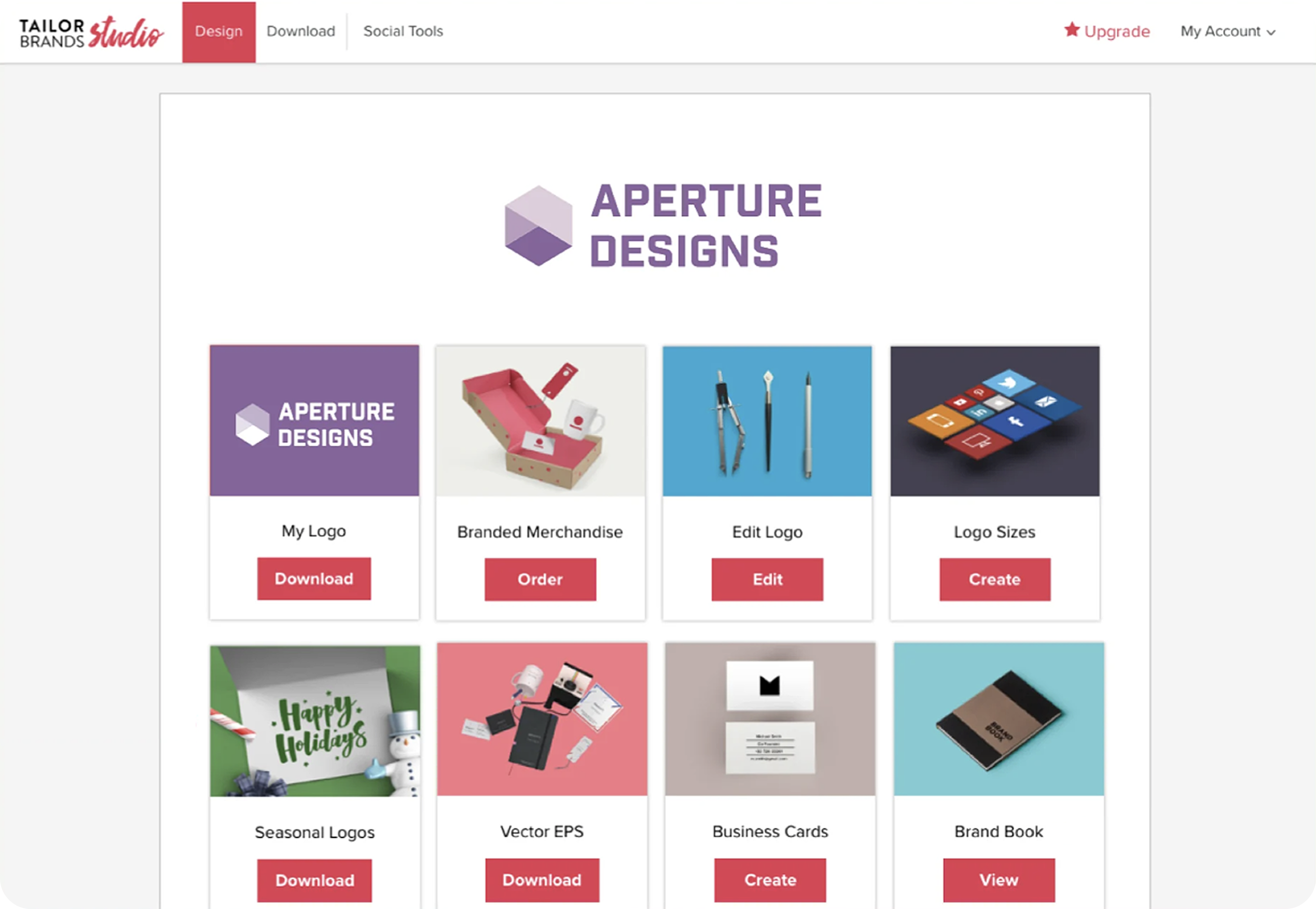
Previous design
Featuring an unscalable layout, no clear hierarchy or guidance, limiting approach to text and information and lot's of calls to action.
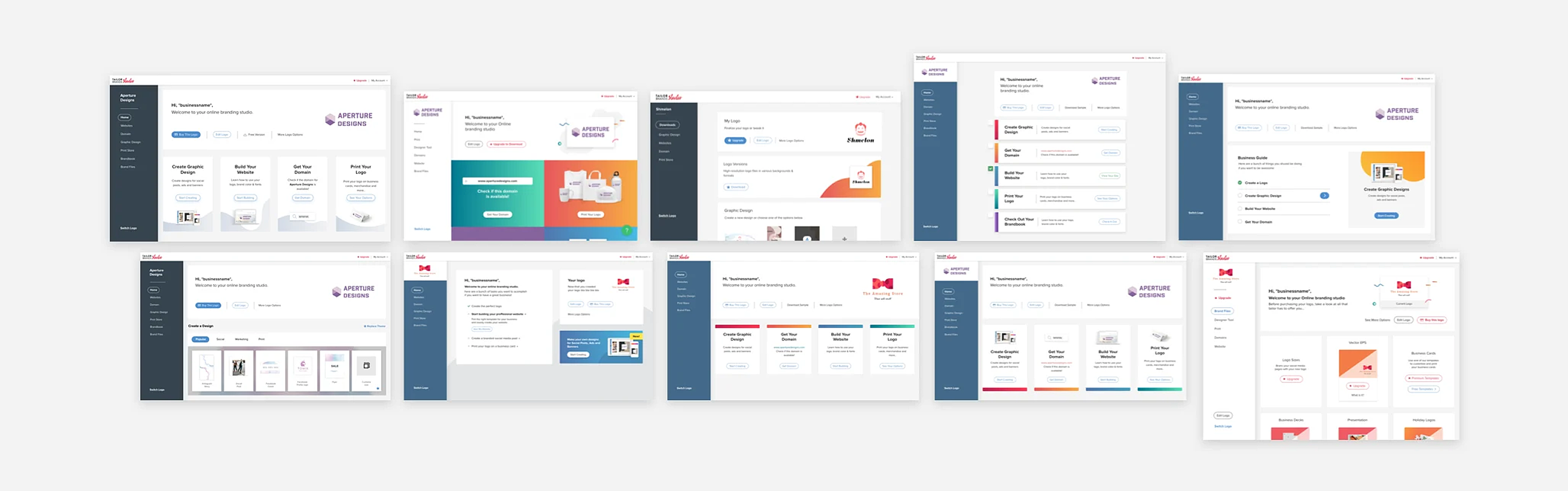
Exploring different directions
Redesigning the Studio wasn't just about improving the UI—it required defining the right first-time experience.
Two questions guided the exploration:
1. How do we celebrate the user's achievement while encouraging exploration?
Users arrived excited to see their newly created logo, but our objective was to help them discover the broader value of the platform.
2.How do we guide the user without overwhelming him?
Rather than exposing all of our assets and capabilities at once, we explored different ways to prioritize actions, introduce features gradually, and guide users toward meaningful first steps.
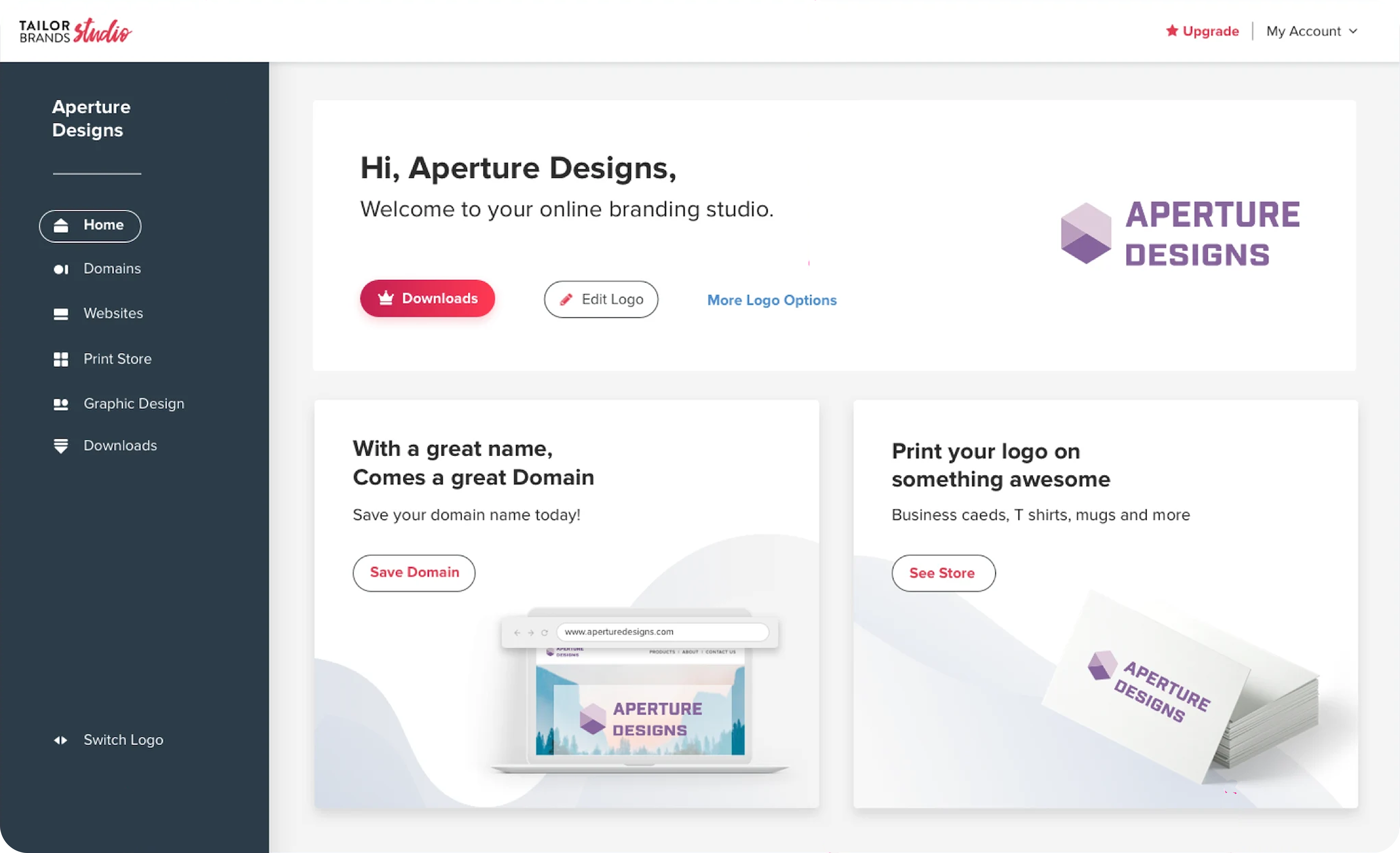
The final design
I focused on a few design decition;
1. Celebrating the user's new brand
Users arrived at the Studio moments after creating their logo, a key emotional milestone in their journey. I wanted the first experience to celebrate what they had just created. I chose a minimal approach that placed the newly created logo at the center. The logo became the hero of the Studio homepage, helping users feel ownership over their new brand while naturally inviting them to explore what they could do next.
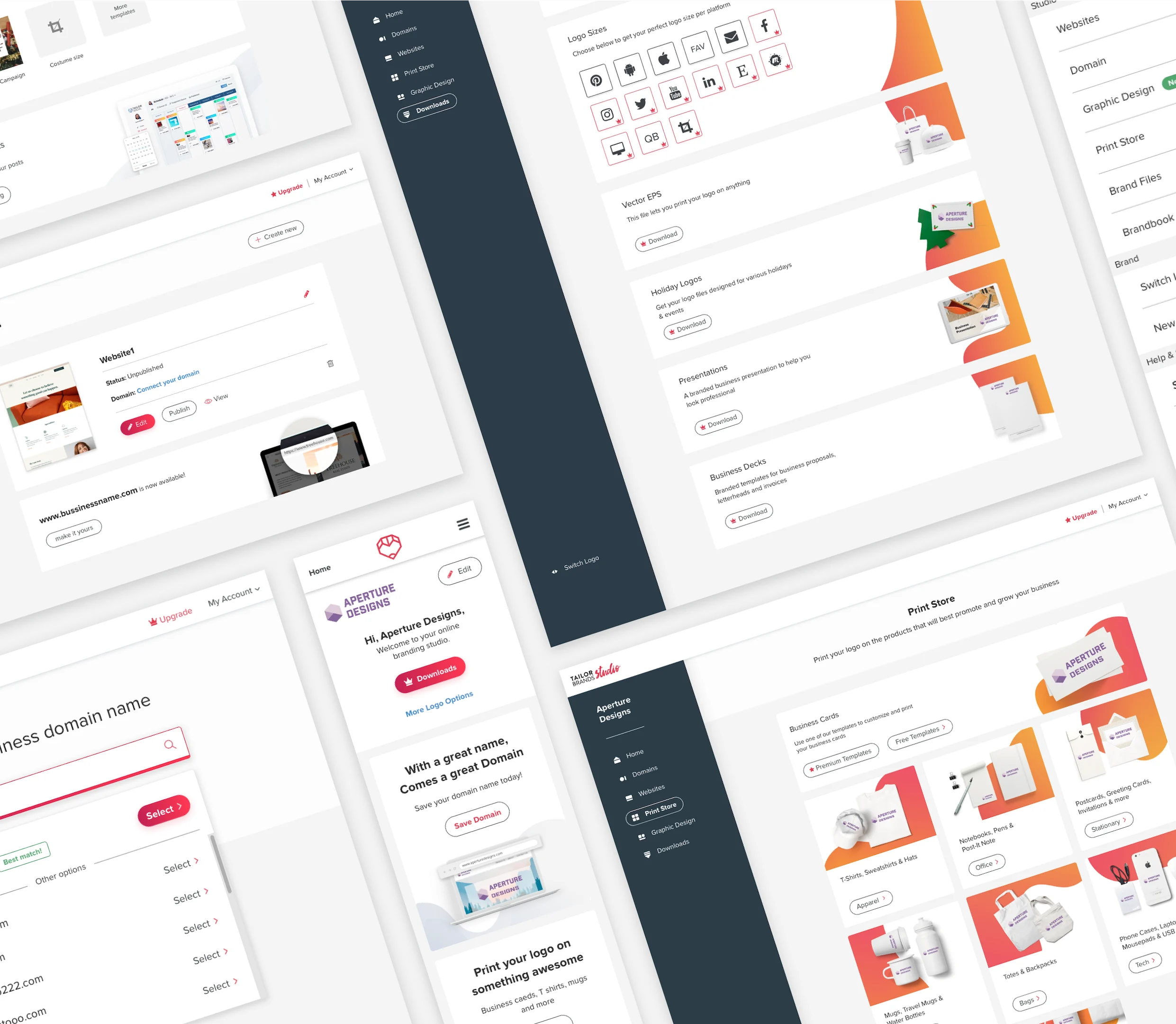
I explored different approaches for prioritizing content and ultimately decided to highlight 2 high-value actions while allowing users to discover the rest.
One of the key actions was domain registration. From a business perspective, it was a valuable conversion opportunity, but it was also a natural next step for users who had just created a brand identity, securing a domain name for their new business.
I also highlighted business cards, which were one of the most desired assets among small business owners at the time, especially in the US market. Users could generate an initial design for free, while customization options and additional templates were introduced as part of the paid experience.
Key learnings
1. Less is more.
It's a cliche but it's true - presenting the user with less options in the home page proved itself as the right thing for our users at the point of their journey.
2. Give users what they want and show them what they need.
Small business owners often need guidance as much as they need tools. The most successful experience balanced user intent with clear recommendations and next steps.
Assumptions are useful, but user behavior is the ultimate source of truth. Continuous experimentation helped us validate prioritization decisions and uncover insights we would not have reached through intuition alone.