Onboarding Redesign
Lead Product Designer.
Conducted user persona definition,
established UX strategy, user testing, UI design.
Worked alongside a rotating group of 3 product managers,
5 developers & a junior designer.
Low-touch users struggled with initial setup, resulting in delayed activation. The shortest path to value meant rethinking onboarding from the ground up.
Context
Yotpo primarily serves mid-market companies with dedicated Customer Success Managers. To broaden its user base, Yotpo started targeting low-touch users, focusing this initiative on the Yotpo-UGC product, which enables merchants to collect and leverage user-generated content.
The problems
Although the onboarding had a high conversion rate of 65.5%, a deeper analysis revealed several underlying issues:
1. Users skipping actual activation
Users didn't activate the Reviews widget on their site, meaning they were unable to use the product.
2. Outdated experience
The onboarding experience was outdated and no longer reflected the product's evolving capabilities, misguiding users about its core functionality.
3. Low-touch struggles
Low-touch users, in particular, struggled with the initial setup and integration process, resulting in delayed activation and lower product adoption.
Sign up
Email setup
Widget install
B2B page
Active 2
Goals & KPIs
Primary
- Increase 'Active 2' users by at least 5%
- Increase same-day onboarding completion
Secondary
- Reduce churn
- Decreasing dependency on Customer Success Managers
Existing Experience
As we only looked at the final number, 65.6% onboarding CVR and most of Yotpo's merchants used a CSM to onboard - the experience haven't been touched in years. But once we looked at it with a fresh prespctive and dug dipper in the numbers, we quickly realised that this flow need a full re-thinking.
UX research
What makes a great onboarding?
Competitor and best-practice research pointed to three principles that became this project's core values:
The onboarding is the first impression of the product, so it needs to be an easy, engaging experience.
Give users a sense of accomplishment, by focusing each step on a single, uncomplicated task.
Motivate users to continue by showing value at every step.
User research
Our main persona was low-touch users going through onboarding themselves. We built on low-touch personas that had been previously defined as part of a broader research initiative I led, allowing us to focus this research on onboarding-specific behaviors and pain points.
Internal research also revealed a second audience: Customer Onboarding Managers, who would benefit from a self-served flow that enables merchants to complete the initial setup independently.
Low-touch users
Merchants onboarding on their own, typically without support.
🎯 GOALS
- Getting reviews live on site ASAP
- Set up the product and let it run with minimal maintenance
- Complete setup without assistance
😤 PAIN POINTS
- Missed important information
- Don't understand the past-orders feature
- Hard to visualize the outcome
- Complex widget installation
Onboarding managers
Internal team members helping merchants set up successfully.
🎯 GOALS
- Scale onboarding without increasing manual effort
- Help merchants reach activation faster
- Ensure merchants configure the product correctly
😤 PAIN POINTS
- Limited support for non-Shopify users
- No representation of the merchant's product catalog
- Hard to visualize the outcome
The challenges
Sending Review Requests is the first essential step in collecting reviews and becoming an active user. But many users felt uncertain about taking that first step, they needed reassurance before reaching out to their customers, worried they were doing it right.
How do we give users the confidence to send that first review request email?
Installing the Reviews Widget early in onboarding was essential for long-term success, but asking users to install it before they'd collected any reviews felt premature and made them hesitant. The tension was real: we needed adoption early, but the timing felt off.
How might we encourage users to install the widget before they collected reviews?
While we wanted users to complete all the necessary setup steps, we knew that too much friction would cause them to skip through or abandon onboarding altogether. The challenge wasn't just getting them through the flow, it was keeping them engaged.
How do we break up technical complexity with moments that feel rewarding?
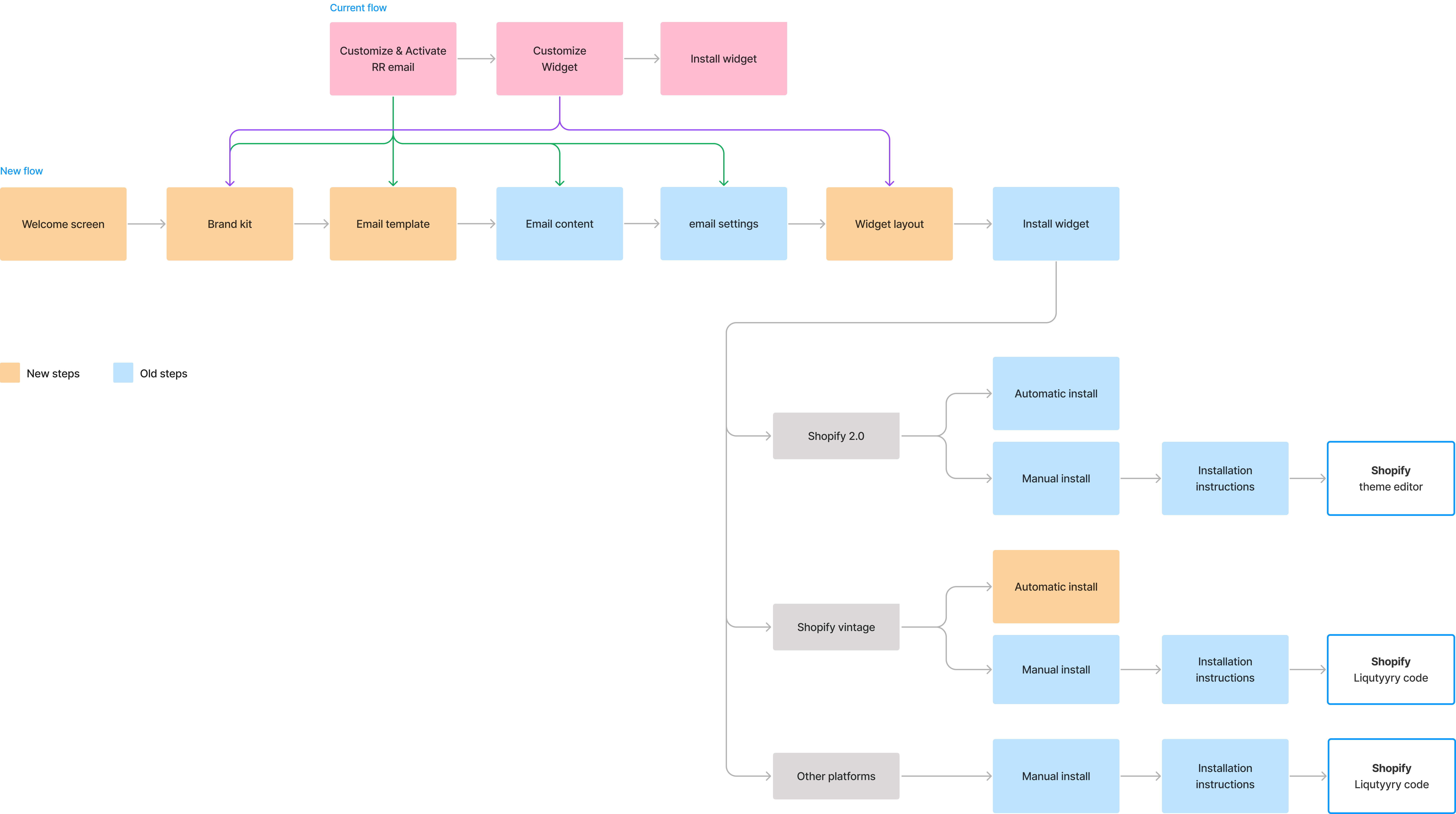
The user flow
Design process
We focused a lot of thought around the Review Request emails, as they were the gateway to using the product.
We kept improving this part of the onboarding, aligning it to our guiding values.
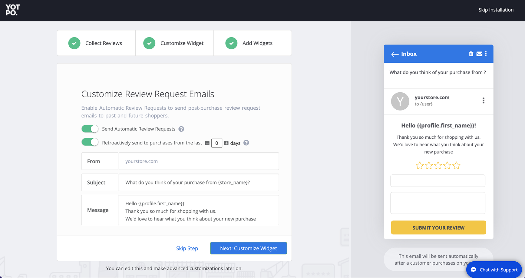
OLD EXPERIENCE
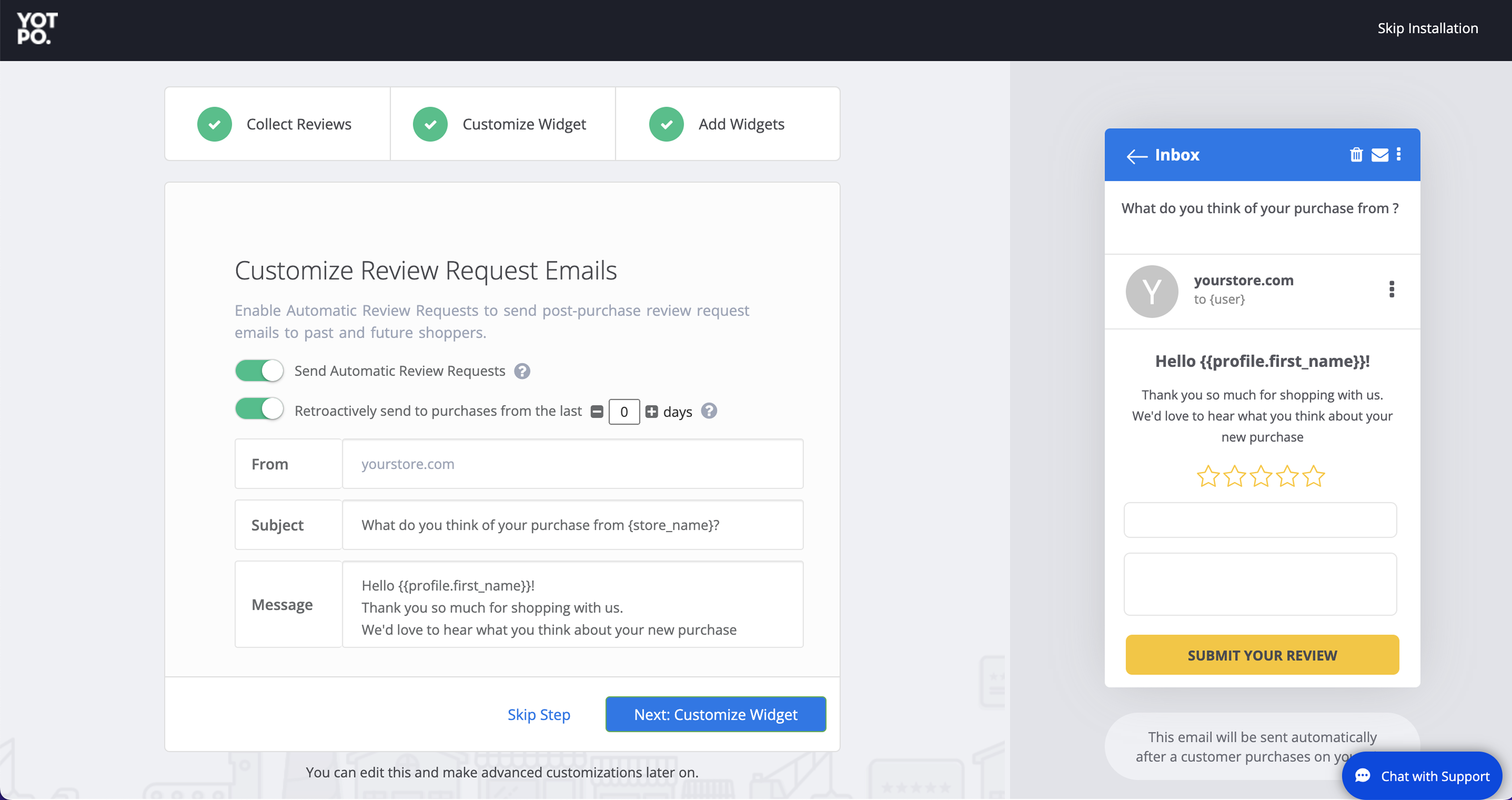
Doesn't use the new capabilities we have in the product.
No way to add your logo. That's a task you'd have to do after onboarding, but without it the email isn't branded.
The settings aren't clear. Users often weren't sure what the opt-in settings would do, and were frustrated as a result.
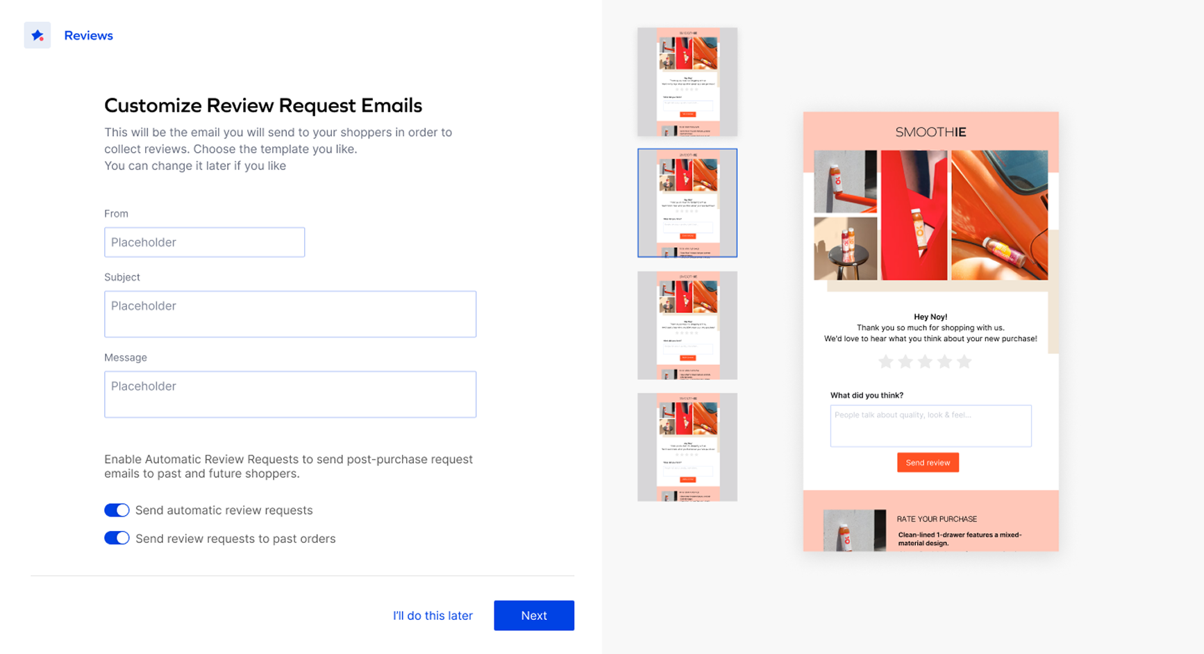
First iteration
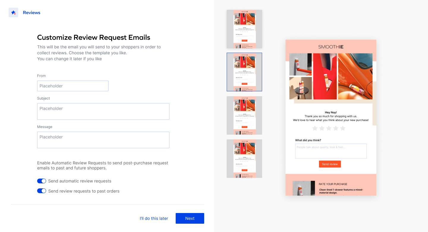
We pulled the user's logo from Shopify and showed it in the email.
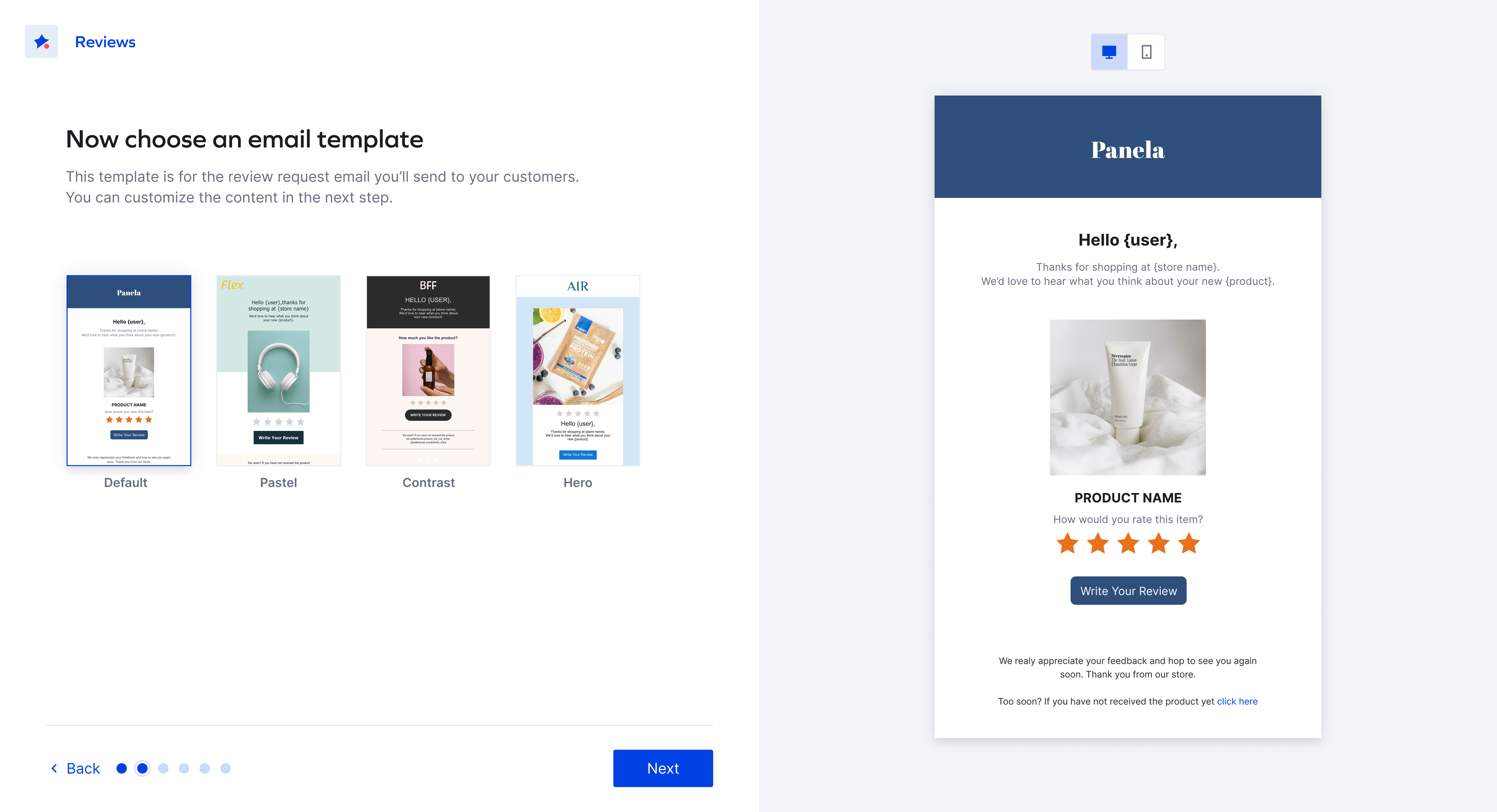
We added the new email templates.
We improved the copy, explaining what this email is and what will happen once it's sent.
Too many actions in one step. Overwhelming.
Users weren't invested enough in the email to start sending.
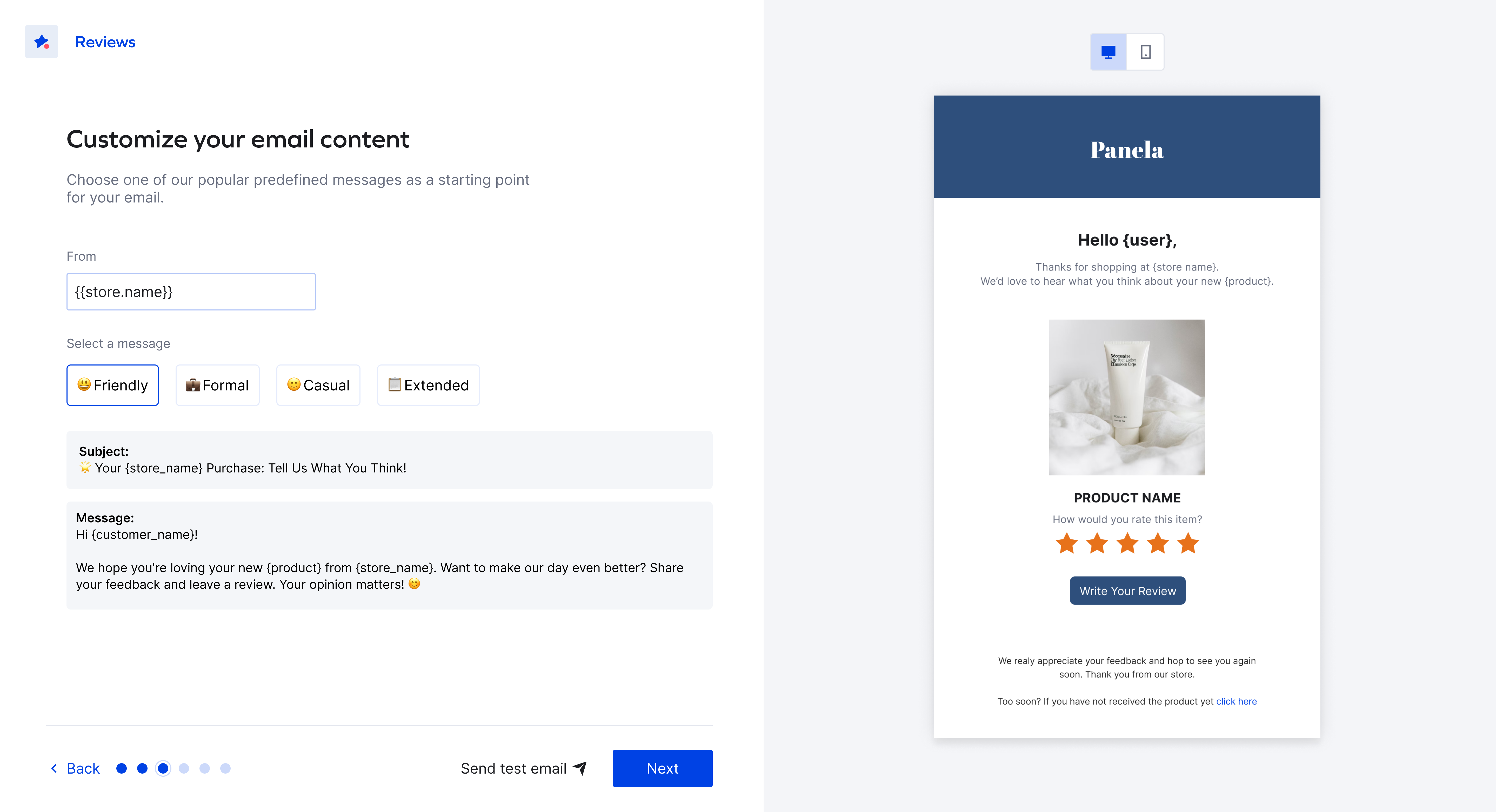
Users got stuck on the email's message text, so the step took them a long time to complete.
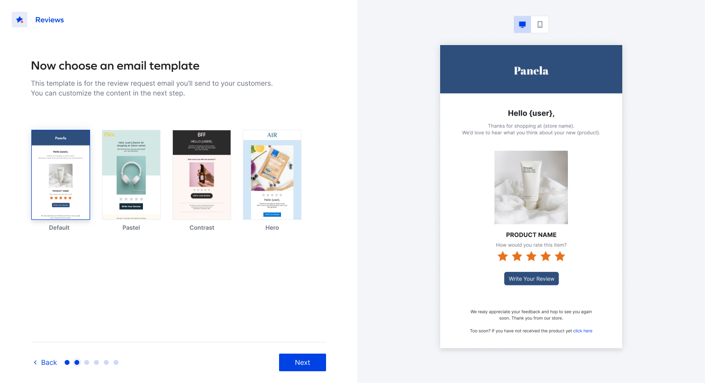
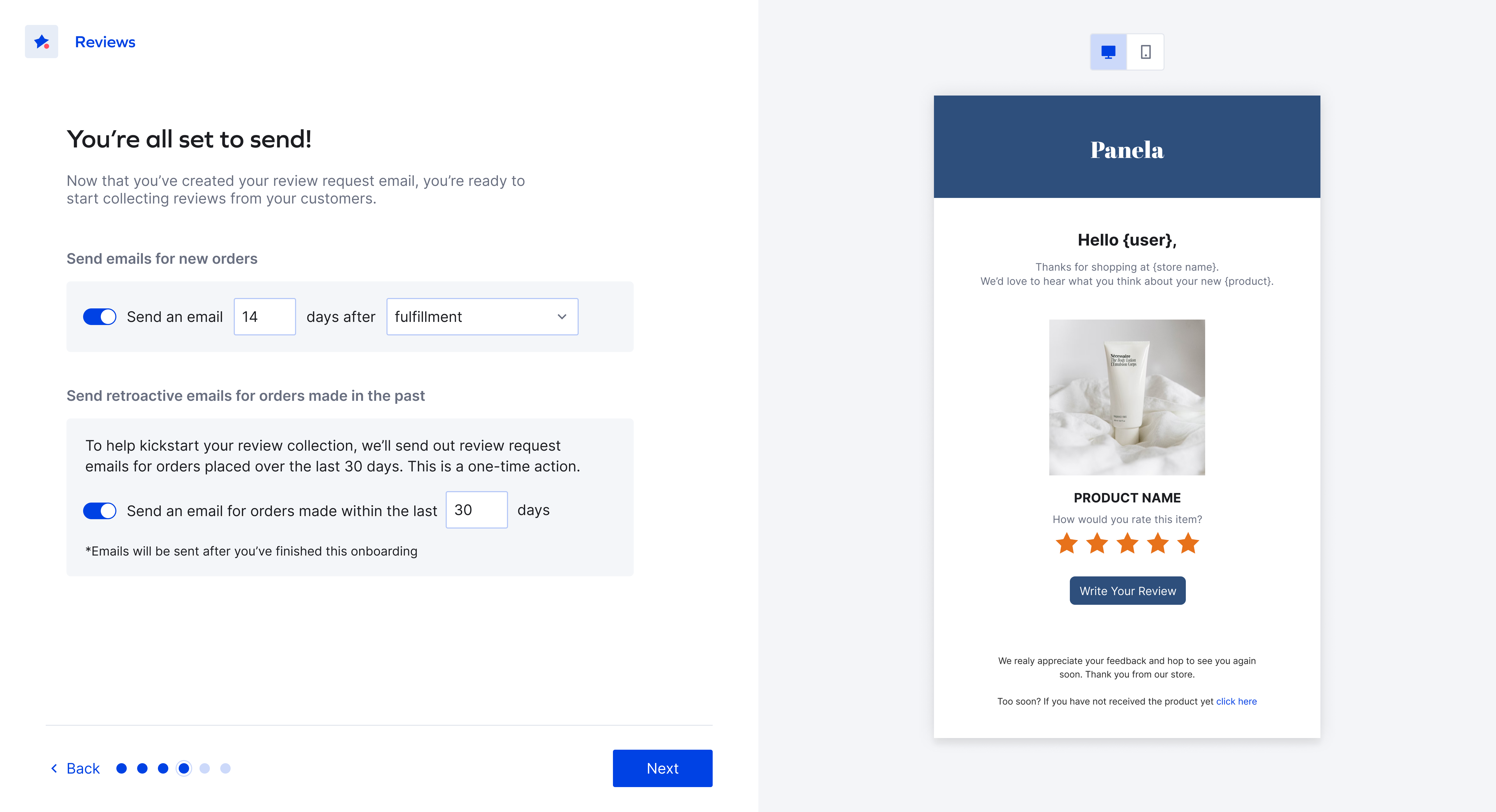
Delight users with an easy, visual step, always showing a live preview of the email on the right.
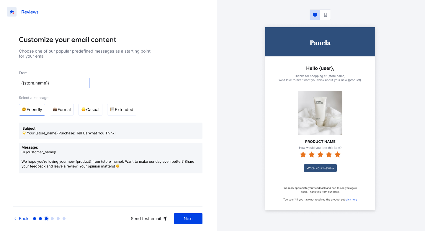
Focus the user on the content and help them get started with a new capability: pre-made messages in different tones of voice.
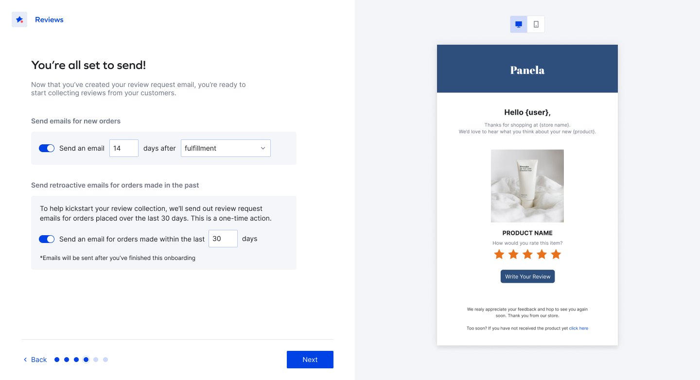
Give users more control and certainty with improved technical options for the email settings.
Final design
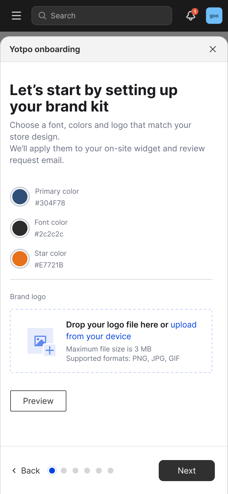


Outcome
the same day
Key learnings
- 1. Adding steps can add value and actually simplify the flowKeeping it short dosen't always serve the purpose. As long as the flow works as a whole and each step is focused on 1 task - adding steps can actually simplify the flow.
- 2. Prototypes can change your approachBuilding a working prototype surfaced problems that static mocks didn't - It's always important to test the flow as you go and "feel it out" yourself, even before sending it out for testing.